My Step-By-Step Post Processing Workflow (Lightroom)
- Sean Foley

- Dec 22, 2023
- 3 min read
I am often asked about my post processing techniques and what adjustments I make to my images and while obviously there are different techniques applied to different images, I thought it might be useful if I shared my basic workflow and some of what I've learned so far. In this article I'll take you through my workflow step by step starting with the RAW file and I'll try to go into a little bit of detail as to why I make each decision.
The RAW:

So I think it goes without saying, the most important part of the workflow is taking the photo itself. I always try to have my photo looking as close to ready as possible in camera. If a photo is overly cropped, the exposure needs to be greatly adjusted or just has any major elements that need to be hidden/removed, it often shows. While of course, this doesn't always mean that a photo is ruined if any of the above is true, it's always better if you have everything looking as close to ready as possible straight out of camera.
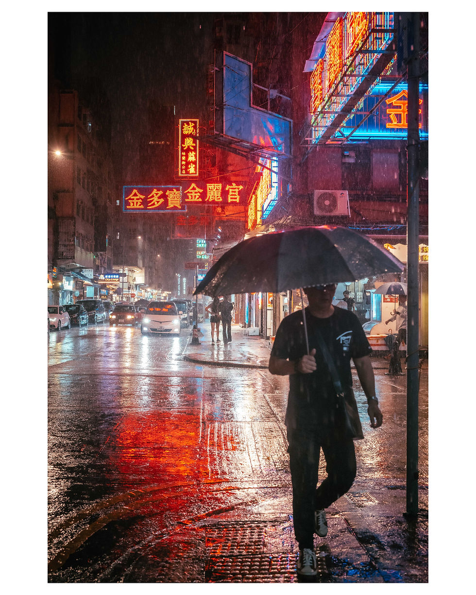
With today's example, I chose an image that I think already looks great without any adjustments, however, with a bit of work we can take this image to the next level.
Step 1 - Crop, Calibration & Basic Corrections

My first step is to crop in ever so slightly and straighten the image. There's not much science to this, I just decided that it looked better to my eye by ever so slightly cropping in.
Next thing I do is head down to the colour calibration. For this image, I have pushed the red primary towards orange, the green primary slightly towards aqua and the blue primary towards aqua.
Then exposure. The exposure in this photo was pretty much how I wanted it, so I barely changed anything, however I did add more dynamic range by lowering highlights and lifting shadows.
Step 2 - Tone Curves

I find tone curves to be the best/cleanest way to add and tweak colours in a photo. Some people prefer split toning and while of course, sometimes split toning can be the perfect tool for the job, more often than not I find that it muddies up an image while tone curves can, if used correctly, smoothly and cleanly tweak colours more precisely in each of your shadows, mid-tones and highlights. I recommend dropping 3 nodes where the main grid lines intersect with your curve and make small adjustments back and fourth. You will notice, for example, that even small adjustments in your red channel can greatly effect how not only your reds look, but all your colours, so you will definitely need to go back and fourth between the colour channels to fine tune your image.
For this photo, I actually didn't feel the need to change all that much in the shadows, I mainly have worked with the mid-tones and highlights until I was happy with the result.
Step 3 - Presence & Final Adjustments

After adjusting the tone curves, I found my image lost a little punch, so I added a little contrast in basic corrections.
Now that the bulk of the work is done, I usually spend some time playing around with the presence sliders. For this image, I have pushed the texture slider into the negative, the clarity slider slightly into the positive and the dehaze slightly into the negative. I think this adds a bit more of a "glow" effect which I personally like.
I've also made some very minor adjustments in the HSL sliders, changing the yellow and purple hues slightly.
Finally I added a slight vignette and I was done.
Step 4 - Adding a Border for IG
Obviously this is optional, but as I have decided on a 2x3 crop, while IG uses 4x5, I add a white border. You can just crop your images 4x5 if you like, and sometimes I do this, but I think 2x3 looks better for a lot of images.
The adjustments made in this image were actually all quite minor, but I think in the end it produced an image that was identifiably mine (at least to me). I hope someone out there finds this little guide helpful in some way. I think if I write up another one of these, I'll show you what I do when I need to make more drastic changes to make the image work including local adjustments and some photoshop stuff.


Love this. Thank you!